TRU
2022
The Typographic Research Unit (TRU) is an initiative by the ISTD to help designers find resources for typographic design. As part of the ISTD’s Student Assessment, they asked design students to create a new brand identity for TRU. Not only is my submission one of my favourite projects, it was also awarded a Merit by the judges of the annual assessment.
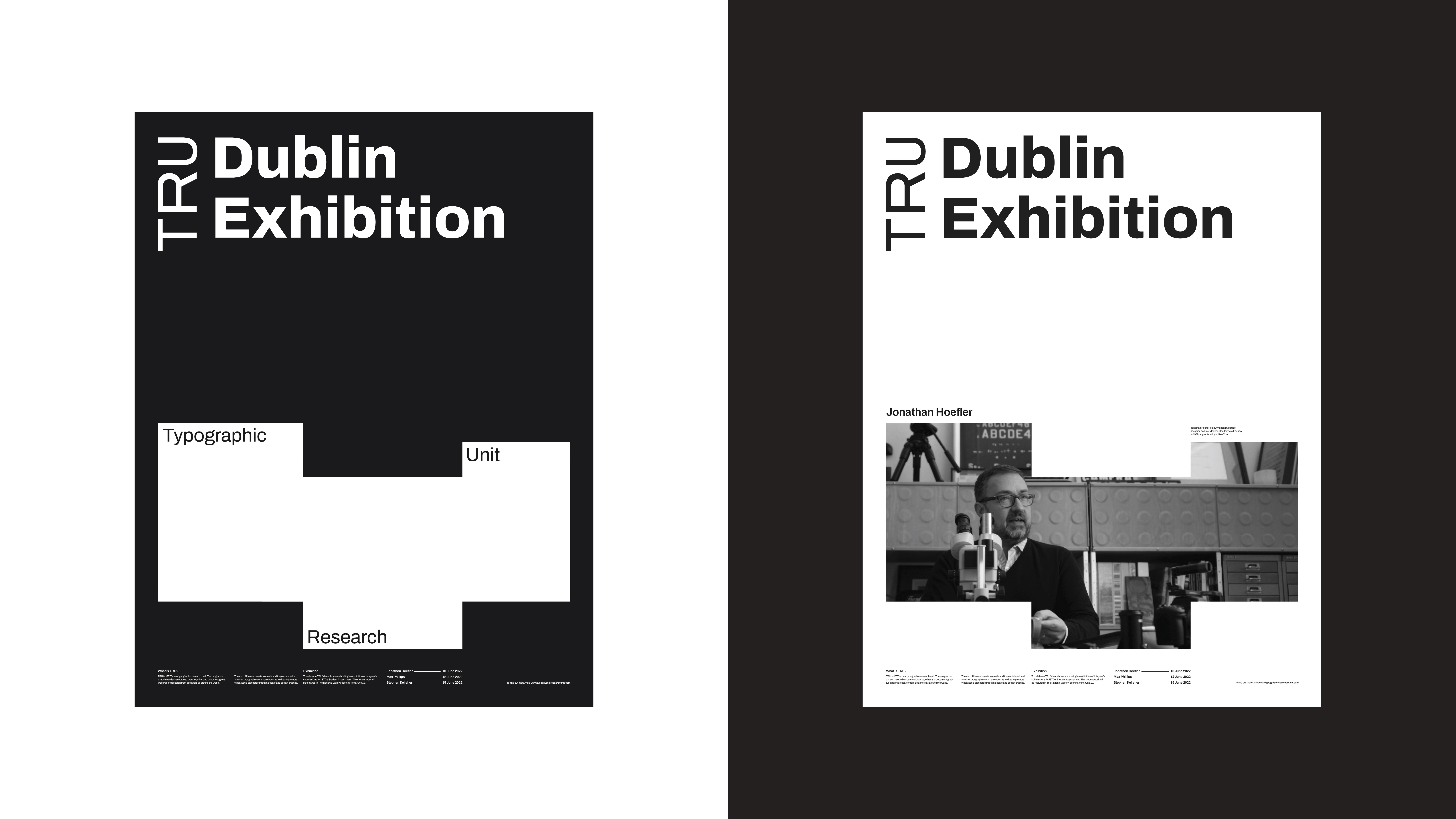
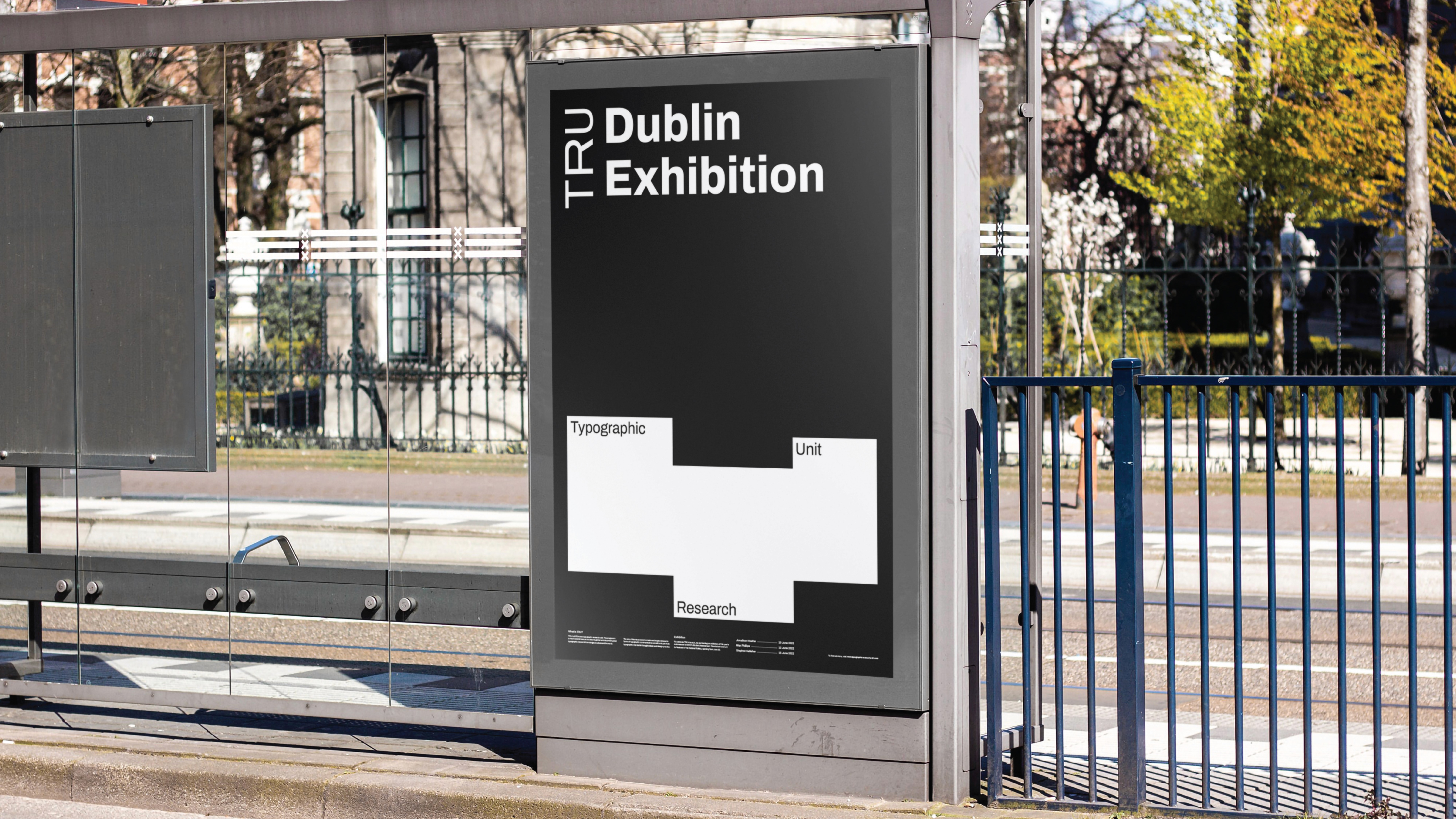
My direction for the brand is focused on merging the past and present of type design, blending older design practices with modern typefaces and motion design.
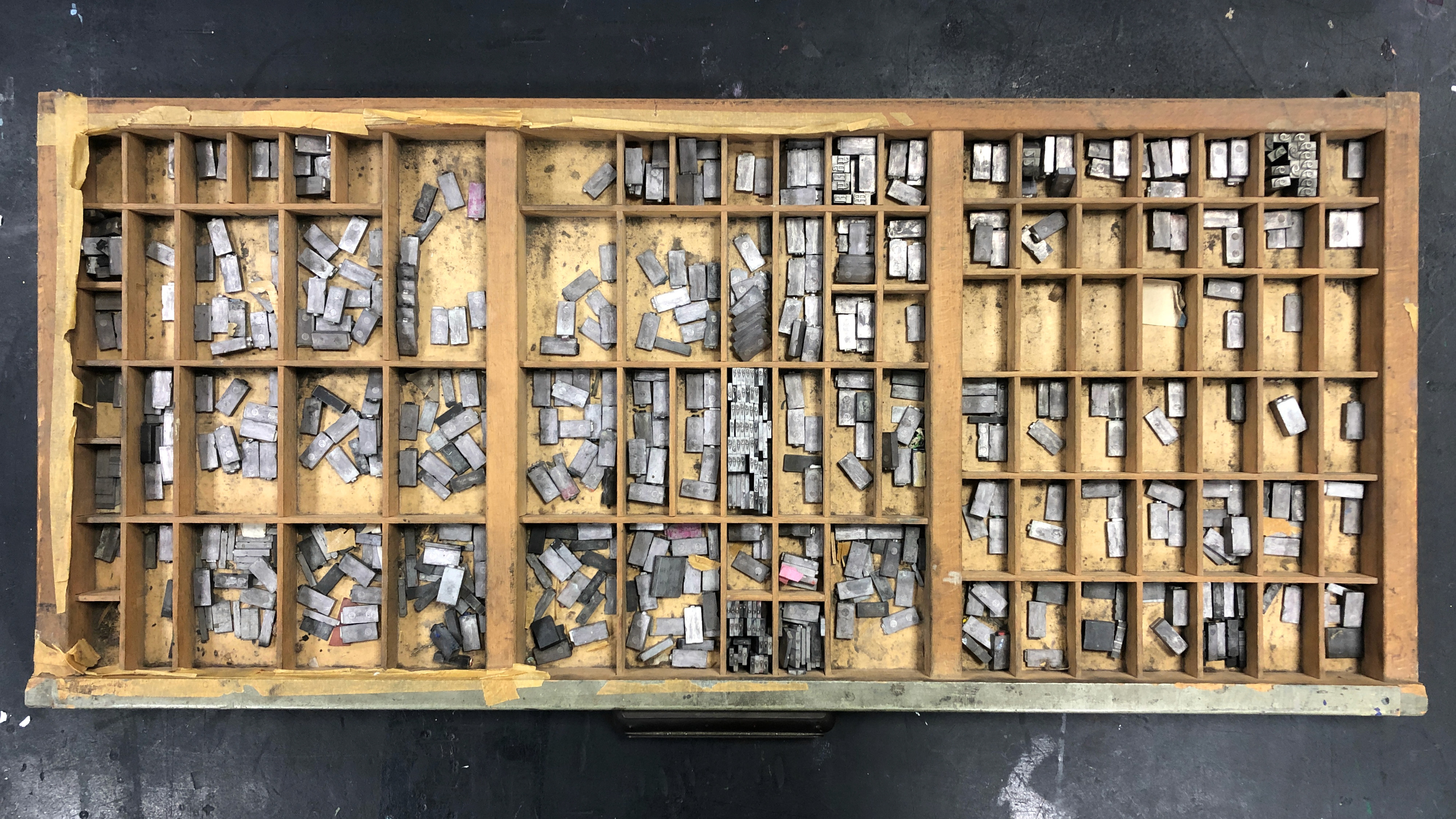
I ended up keeping the identity pretty balanced between ‘old’ and ‘new’. The history of type design is reflected in the black and white colour palette, as well as the box shapes in the logo being based on letterpress sorts. I brought in design elements to suit modern design standards such as motion design, and most importantly a striking sans serif typeface.
Archivo was my chosen typeface for the project, and it became very useful towards my vision of the brand. Archivo is not only clean and legible, it is also variable in width. This meant I was able to mould words and letters to the space they needed to fit.